
Analysing Animal Crossing's Quality of Life update
A way too deep analysis of the cool Animal Crossing Quality of Life Update mockup video that went viral last week.
In the past few days I've seen many people sharing this amazingly well-made fan-made video of Animal Crossing. It's a mockup explaining how Nintendo could update the game in order to offer an overall better experience. Many seem to love these suggestions, but when I first finished watching it I was just left with a feeling of disagreement. I just think that the majority of these suggestions would make the game worse or - perhaps more correctly - a very different one. I clearly don't know to what degree the author @NickHaFIM intended the suggestions to be real improvements vs just something fun for the video, but I'll indulge myself and explain how I feel about the changes, mostly because breaking games apart is always fun and it seems like a nice excuse to talk about game design.
UPDATE [12/05.2020]: The original video has been taken down but reuploaded. Let's see how long it lasts
While I love the execution of the video, my main issue with most of the suggestions presented is that they all try to turn Animal Crossing into a fast and efficient machine when, at its core, the game is meant to offer a slow and laid-back experience. I'll try and focus on the biggest changes, explaining some of the issues and proposing alternative solutions when possible.
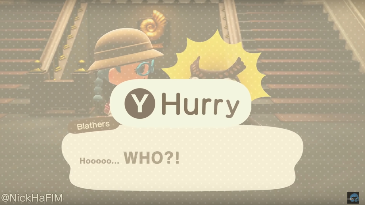
Don't hurry
Some of the dialog in Animal Crossing can get really monotonous, especially if you clock 6 hours a day. The video suggests adding a Hurry button that basically skips all the dialogs in the game. I can't possibly agree with anything like this, but I know that sometimes the struggle is real! I think give a voice to all the characters is too important; it helps characterizing all the villagers and really gives life to the island. Skipping dialogs means turning all these characters into empty vessels acting purely as "obstacles" between the player and their goals, and I think this would have too much of an impact in terms of speed and general mood.
What I think could be a better solution (though I personally don't deem it necessary) is to make the dialogs a tiny bit more dynamic, so that the key characters (Nook, Isabelle, Blathers, etc) have one long conversation the first time you talk to them every day, but then revert to a quicker set of lines after the first exchange. But my guess is that this has been a deliberate choice to prevent players from missing any possible piece of information and give them always a chance to listen to a dialog again.
The problem with stack crafting
We've all had the situation where we need to craft 10x fish bait, and - since we can only craft one at the time - we are basically tapping A for a few minutes while scrolling our phone with the other hand. To make things more efficient, the video suggests to declare the amount of items you want to craft and perform a bulk action, but hey, that leads to quite some issues!
- Time spent: This approach makes things a lot faster! This is not good for a slow game, I elaborate on this aspect more below.
- Inventory space: There is a readability issue in play here. What if the player has enough resources to craft 5 items, but they only have 3 empty spaces in the inventory? You need to add UI elements to visualize this.
- Adding an extra UI layer: I feel like the game is consistently not doing that and mostly tries to keep one layer at the time on top of the background. This seems like an important pillar to preserve.
- Resource tracking: You would also need to visualize some form of preview of the resources diminishing as you change the crafting amount, otherwise you would lose track of the resulting effect of the bulk action. This is more clutter.
- Hot item of the day: The bulk craft would definitely affect the "effort" it would normally take to craft the hot items of the day, having a fairly big impact on pacing as well as overall dynamics in play between the different game systems.
There are surely other issues, but these seem big enough to show it might not be ideal change. So how would I improve this? My suggestion - a simple one - aims to make the experience a bit smoother without cutting off too much time and while keeping the core design almost intact.
- Animation speed: An idea would would be to have the crafting animation play faster and faster as you keep crafting items. This means that the process will get faster as you keep crafting one item at the time.
That's it, really!
// T = Total crafting time for 10 items
// t = Crafting time for 1 item. Set to 5 seconds.

// Original
T = t*10;
T = 50;

// Video suggestion
T = t;
T = 5;

// My suggestion (capping multiplier from the 6th item)
T = (t + t*0.95 + t*0.9 + t*0.85 + t*0.8 + (t*0.75)*5));
T = 41.25;
That looks quite a bit better to me. Slow work is part of the living-on-a-deserted-island lifestyle and you shouldn't make changes that affect that. The entire design is supposed to slow down your already way-too-hectic life spent between commuting, working, skyping, groceries, gym and meetings. Bulk actions would just make you more efficient, and Animal Crossing is not a game of efficiency. You need to take your time and just chill a little bit. In this regard, speeding up the animation over time, while maintaining the overall work time similar would be, in my opinion, the way to go.
In the video there are also other suggestions such as eating multiple fruit at the same time - which seems very unnecessary - and don't get me started on insta-pooping! Again, it seems like many of these things just come from the perspective of wanting to make the game as fast as possible, disregarding the desirable play experience the game is trying to offer.
Simplicity and consistency
Many other suggestions seem to somewhat disregard the core simplicity of the game's UX, as well as ignore some of its visual/gameplay language. For instance, the game almost never adds any big UI layer on top of the inventory. This is ignored in the different suggestions that propose adding extra popups (therefore extra layers of complexity) for stuff like grab multiple, eat multiple, buy multiple. In all those cases I think it would be more correct to use presets (1x, 5x, 10x) like the game already does elsewhere. Suggestions like giving the option to check your inventory directly from the storage screen breaks this sense of visual clarity and also introduces many unnecessary issues (what if I try and eat an apple from the inventory drawn on top of the storage screen?).
Another big no-no, in my opinion, is the idea of adding many "shortcut actions". The video suggests creating a Use action to map to Zr. While this is in theory not a terrible idea, it generates a lot of other issues: what if you press Use on grouped items? Would you then need an extra popup to choose how many you want to use? On top of that, you can't use every inventory object, so would you only be able to use that action for specific items? This would not be in line with how the game works elsewhere! Even the Drop action opens up some of these issues, and it brings back one core question: is any of this really needed? In my opinion I would never sacrifice how consistent the experience is just to save a couple of extra clicks.
There is also the matter of keeping the visuals fairly UI free. This is especially important while running around the island, and ultimately the reason why, contrary to what the video suggests, I wouldn't want to add a visible inventory counter when picking stuff up, nor would I add virtual markers for placing items around the map. It's all just unnecessary clutter that doesn't match with the game's DNA.
Markers are way too intrusive and would completely ruin the clean visuals of the game. This said, the game has an undeniable issue with input precision, but I can't currently think of a fit-all solution to be honest with you! One possible option, perhaps, is that the game could shift some of the input from OnPressed to OnRelease, so that pressing B would initialize the action, you would then have a chance to adjust your angle with the left analog stick, and then you'd finalize the action on button release. This introduces a whole new set of issues of course, starting from an overall sense of responsiveness of the controls, to a less accessible input system, potential issues with making the animations look good, and surely a whole load of other nasty stuff. Game development is hard!
A matter of Accessibility
Animal Crossing is designed to be played by only using one analog stick at the time. It's not a mystery that tons people - especially ones not familiar with game controllers - have a fairly hard time using two analog sticks at the same time. My guess is that this is also something that Animal Crossing inherited from the N64 game, which obviously had only one analog stick (N.B. I have not played Animal Crossing on N64 and I might be full of shit). The game will not ask players to use two analogs, and this is evident in multiple occasions:
- All the buildings can only face south because you are never going to rotate the camera.
- Whenever you pick something up, your character turns around automatically towards the camera, to show the outcome of your action.
- The game camera tilts in fixed angles so that you don't need precision with the right stick.
To me it's important for a game to be consistent with its design pillars, and I never want to compromise them. That's why I am also not a fan of offering "advanced controls" that allow players to hold Zl and use the right stick to use the radial menu. I know...not being able to quickly grab the net when you are chased by bees is really annoying, but if I had to find a solution, I would perhaps think of adding a way to tap a button (perhaps the disgusting left analog click) to cycle through the tools. Any advanced control, for me, is not in line with the core pillar of simplicity. I would also like to mention that being stung by bees is still a very minor annoyance in the big scheme of things; we're still talking about a game with no lose state after all.
This said, I might be unaware of some accessibility issues that the suggestions in the video might perhaps address. But what I want to really stress out is that every solution should try and fit with the rest of the design in the most consistent and elegant way possible!
A sense of reality
Animal Crossing tries to make the world and all the player's actions feel as real, tactile, tangible as possible. It might be weird to say, but the inventory is, in my opinion, an extension of this principle. It's the reason why you can't eat 10 pears at once but you just eat one at the time. It's the reason why you can't open the storage if you're not at home. It's the reason why some of the interactions feel a bit cumbersome and you feel like you are doing actual work. A gift takes one slot, but if you want to wrap it, the wraping paper will take another slot, and you have to deliberately wrap the present; you can't just wrap it on the fly.
It all just feels real and tactile. And what is the only item that breaks this governing rule? You probably guessed already - a magic wand!
I think that supporting this sense of reality is quite important if we want to keep the nature of the game intact, so for instance I don't think we should go as far as allowing the player to use resources directly from the storage. There's no magic space in Animal Crossing, you are literally carrying things with you, you are doing stuff with your tiny hands. This needs to stay this way!
It's not about the money
One suggestion that I like is the one about quickly seeing you which items you already own / have donated. I think it could be an ok addition to make things a tiny bit clearer for the player. But - surprise surprise - I think that the suggestion in the video is going too far: it proposes to show how much every items costs and can be sold for.
I really dislike this.
Yeah, I know what you are thinking, I'm spending all my weeks buying and selling turnips, so it *is* about the money, but I still don't think it is! It might obviously just be my personal experience, but in Animal Crossing you don't really need money, and the game is not even really pushing you to earn it. While it is true that you need it to pay your morgages, after you are done with those you almost have no reason to make more money, other than moving some buildings around to improve the look of your town (and to isolate the villagers you dislike). You usually just end up with an abundance of money and miles, and I am still genuinely unsure what I'm ever gonna do with all of it.
It's also important for the game to make sure it's not shifting the focus too much towards buying and selling stuff (the Turnips do all the heavy lifting), so I think any intrusive UI element focused on this aspect can be nuked into orbit right away!
Dressing room
This is a tough one! Every time I am in the dressing room I wish I could just buy multiple items of the same type at once, so I perfectly see where this suggestion is coming from. While I don't have a perfect alternative approach for this, I think it's fun to take the chance to analyze the implications of the idea presented in the video.
First of all, by allowing players to select multiple items to buy, you are radically shifting the design of the space. It's not anymore a place where to quickly try different clothes on, but a place where to buy tons of clothes, almost going through a checkbox to make sure you own everything. I think this, per se, is bad enough.
From a strictly mechanical point of view, you are also saying that the player needs to press A twice on every single item if they just want to try stuff on without buying. This is potentially really bad! One way to address this would be to have one button to try things on, and a different one to put the item in the chart. This doesn't really align with any input in any other part of the game as far as I know, though, so it doesn't seem like a viable option either.
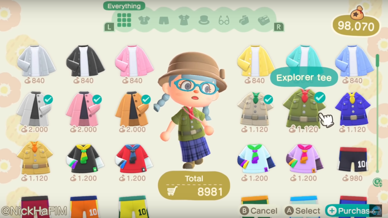
Then there is also the question of what to do with all the clothes. What happens if you buy 50 items? Do you send all of them in the storage room? And what if you also want to come out of the dressing room with one specific outfit? You will need to select all of the items of the outfit for last, I assume? And what if you don't have space in the storage room? Soooo many consequences! As you can see it's never an easy choice and game design is a constant act of trade offs. There is rarely an easy solution, especially when you have many systems in play at the same time.
Final thoughts
So far I've mostly focused on all the things I disagree with, but I am actually onboard with some of the suggestions in the video. For instance, sorting the inventory is one thing I wish I could easily do, and it would make sense to introduce this since we have Sorting in other parts of the game already. I can't currently think of a reason why this can't be introduced!
One other thing I want to mention is the Dodo Airlines phone app. I think that the idea to allow the player to open and close the gates from anywhere on the island is potentially good (it's currently quite cumbersome) but I am not a fan of the suggested execution. Animal Crossing rarely interrupts the action with big UI screens, and if the player can contact the airport I think all of the options should be presented as dialogs in a phone call; the player is already familiar with this since it's exactly what happens when traveling, and I think it would additionally give breathing space to Orville and Wilbur, the two cute dodos that take care of your traveling. There are still many possible implications of such a change though, perhaps it's done on purpose to prevent the player from changing things on the fly while there are visitors on their island.
There were many other things I wanted to mention in this post (ie how the game shouldn't have a settings screen) but I feel like I would need to elaborate on too many aspects and details, and it might get too boring. If anything, I do very much enjoy diving into all these aspects of game design; one of the most exciting things for me is to understand why game developers take certain decisions when making their games.
Again, this stuff is super hard and I've read in multiple places that the current implementations are a result of the devs not understanding their audience or their game. I think this is such an arrugant thing to say! What I want to emphasize is that sometimes it's just fairly easy to look at seemingly simple games and point at "mistakes" that developers make, but in doing so it's very common to miss the reasons that led to those decisions in the first place. I am pretty sure the video was mostly intended as a fun community video and it very much succeeded in that regard, I'm still shocked by how well-made it was! For me it was the perfect excuse to dive deep in game design talk, I hope this was somewhat interesting to read. If you got all the way here, then thank you for your time. Feel free to ping me on Twitter if you wanna dive deeper into this conversation.
If you wanna read more of whatever goes through my head, you can subscribe to the blog and you'll get notified whenever I post something new. It's a very good deal, trust me.